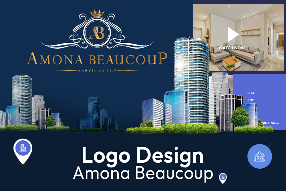
Amona Beaucoup – Logo Design
Amona Beaucoup
Challenge
Amona Beaucoup began its journey in 2018, and quickly established itself as a top-notch financial advisory service employed by HNIs (High Networth Individuals) for financial advice in the Mutual Funds sector. Understanding that the real estate market held a huge scope of potential to maximize their profit, they decided to venture into the property industry in December 2020.
Being well established already into finance, they wished to indicate to their clients that they offer more than financial services, while also being approachable to new clients. They wanted a rebranding of their logo & desired to fully utilize the scope of the online medium for conducting business.
We launched into their predicament offering to create a new and improved logo to which they would be widely & easily recognized by. We also pointed out their need for a website and offered the same.

The Solution
The team at DigitCure firstly identified the requirement of understanding the type of clients Amona Beaucoup catered to. Through multiple discussions with the founders, a target of HNIs and people living in extremely high standards was selected. Amona Beaucoup, in finance, only dealt with clients that had surplus finances, so obviously they wished to retain that quality of clientele.
The colors we chose for the reworked logo are those that symbolize to the one viewing that the intention to achieve, accomplish & triumph is ardently driven into the very core of the establishment. These colours also represent wealth & success. Gold, blue & black discern opulence, material riches & indulgence. The logo was also designed so as to be applicable as a sign board or even as a flag.
The requirement of a website is not just a luxury of a business, but in today’s highly competitive business environment, is necessary. The impression that a web visitor has of your business is not only built around the quality of service you provide (which is very important), but also the layout and design. A well established business never has a shady or sketchy looking website, everything’s in order and the navigation of the website is easily accessible. In line with such standards, we developed a website that represented Amona Beaucoup’s idea of luxury.
The Results
- In adapting to modernism, Amona Beaucoup took the initiative of evolving and the signs of a positive impact on their business has already begun to unfurl. Through troubling times, they’ve more than managed to keep their business afloat and though their journey of advertising & marketing with us is ongoing, we believe that the services provided by DigitCure will take them a long way!


