Dipi Doo's - Branding & Packaging Case Study
Client Overview
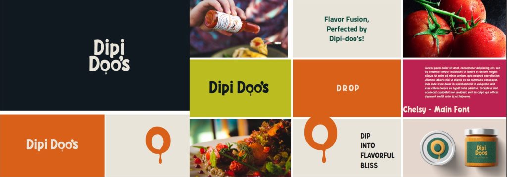
Dipi Doo’s is a bold and flavorful sauce brand that boasts a fun and playful personality that aims to bring more fun to users’ meals through great taste and eye-catching packaging.
Challenge
Dipi Doo’s wanted to have a complete brand image and packaging design to be noticed in the competitive sauce market and to attract consumer eyeballs at retail shelves.
Solution
Complete Brand Development:
- Logo Design: Designed a vibrant, fun logo that visually represents a strong taste profile
- Visual Identity: Established an integrated design system that embodies the essence of the sauce brand
- Brand Messaging: Crafted a compelling communication strategy
- Packaging Design: Eye-catching shelf presence with strategic visual appeal
- Brand Guidelines: Comprehensive standards for consistent brand application
Results
The strategic branding action plans effectively made Dipi Doo’s the unique sauce brand, where a solid shelf presence is visible that connects to the targeted customer groups and, thereby, gains brand recall in the competitive food market.
Conclusion
Dipi Doo’s brand-building initiative is a classic case of strategic design and packaging leading to a significant market differentiation for food brands.